
by Jean Marie Carey | 20 Oct 2013 | Art History, German Expressionism / Modernism
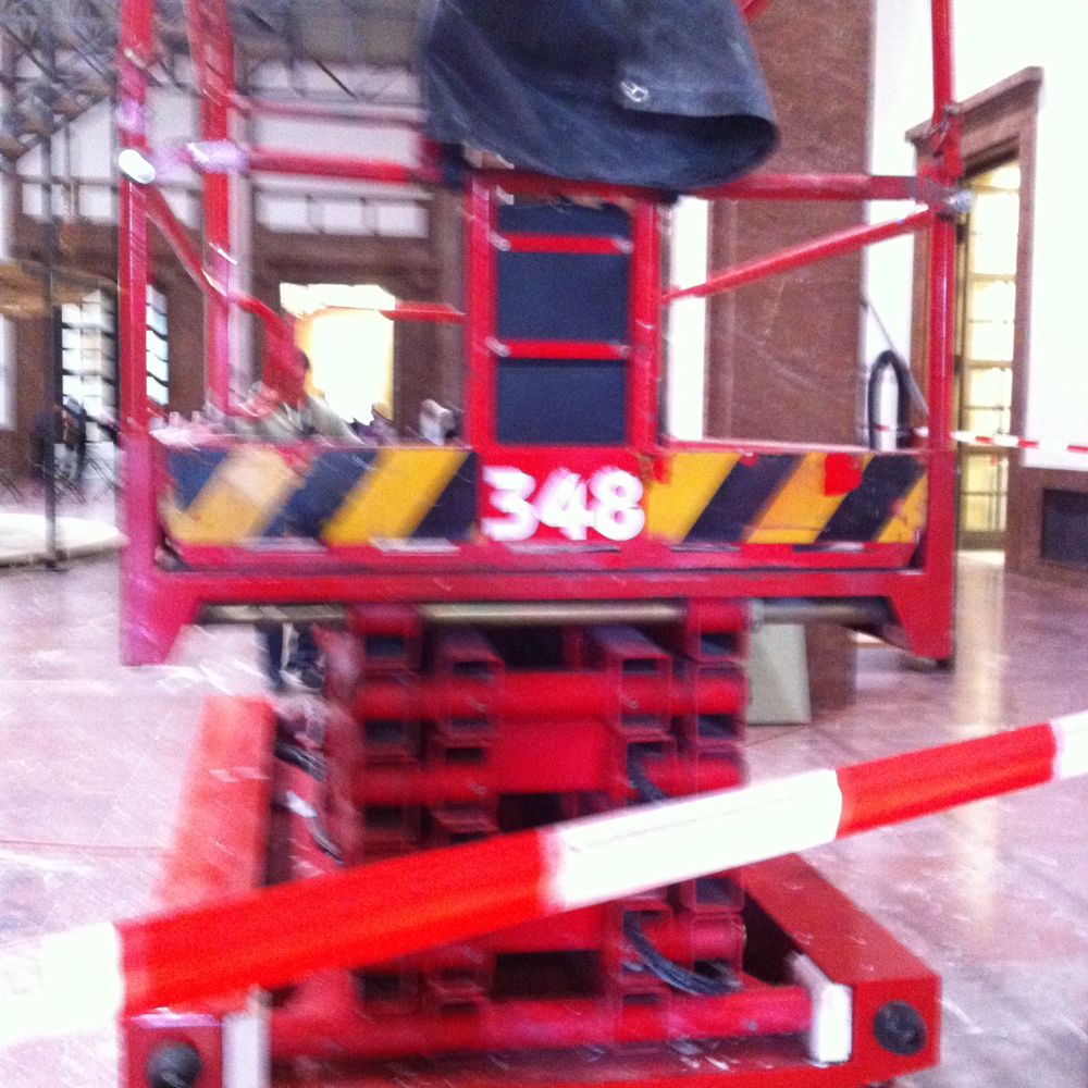
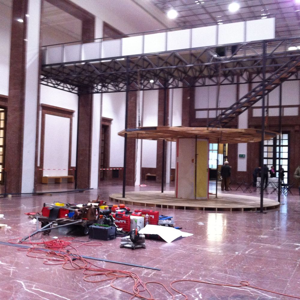
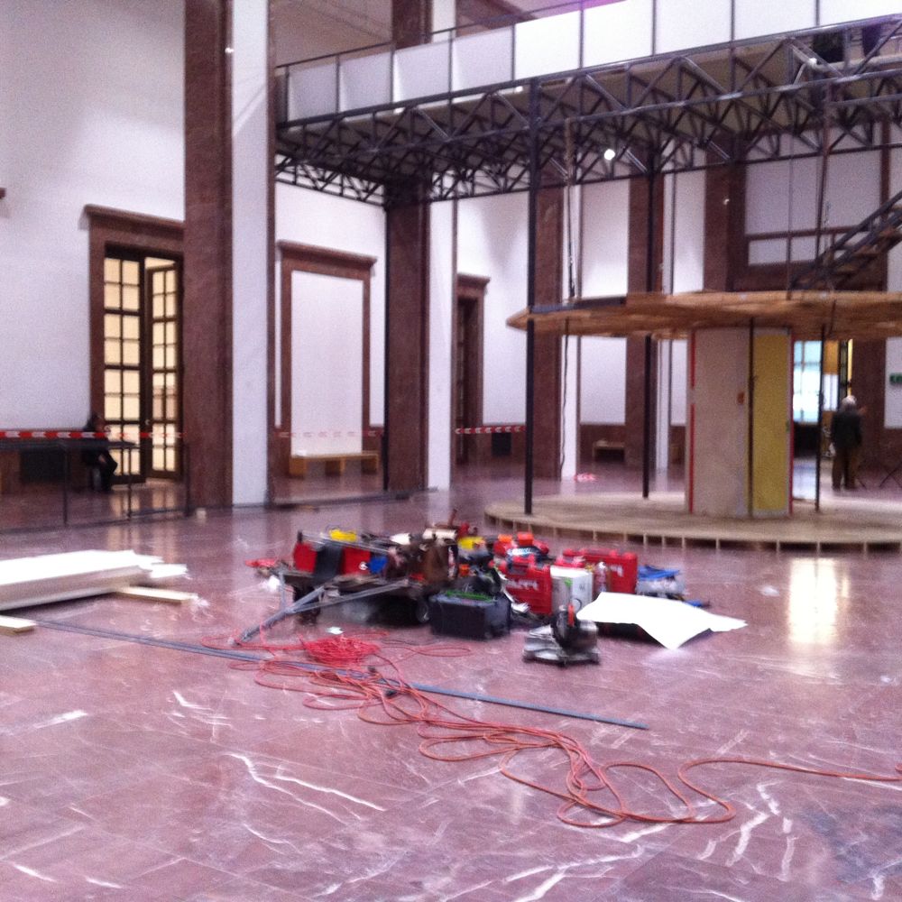
I cannot explain better what 18 of the 21 photographs above are better than the Haus der Kunst press release about this very subject, so here it is, partially ellipsed for brevity:
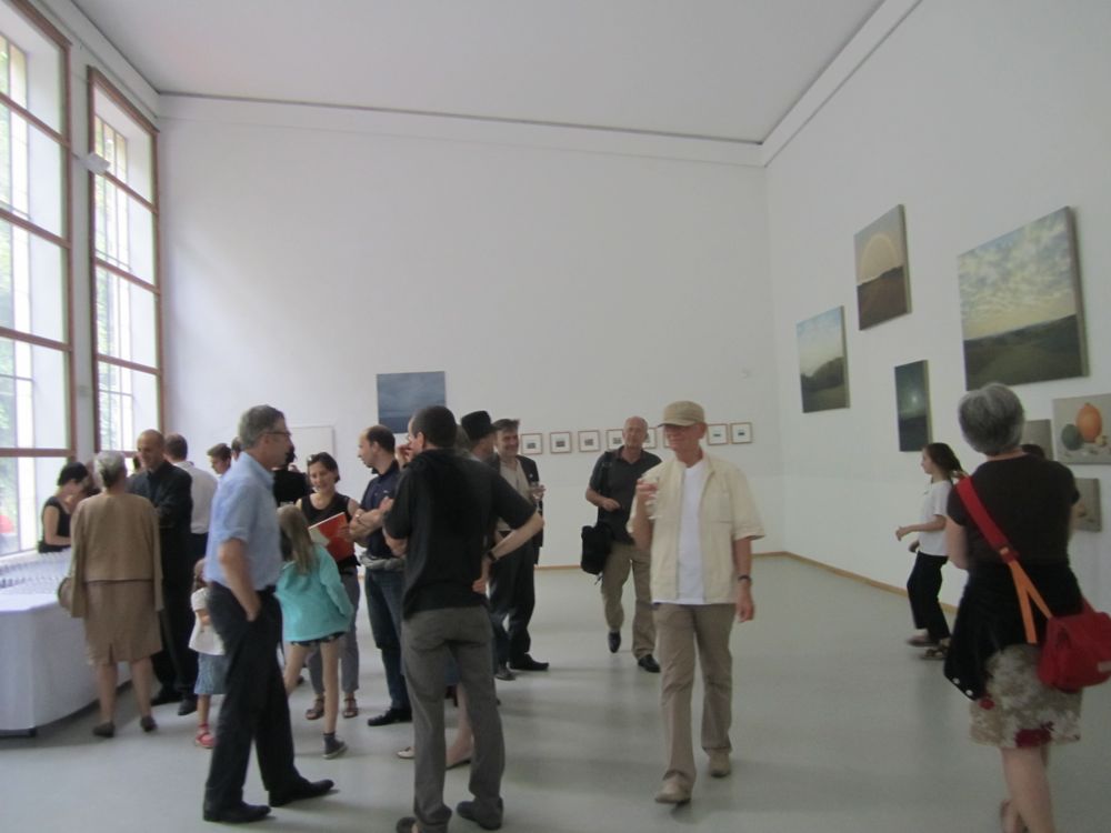
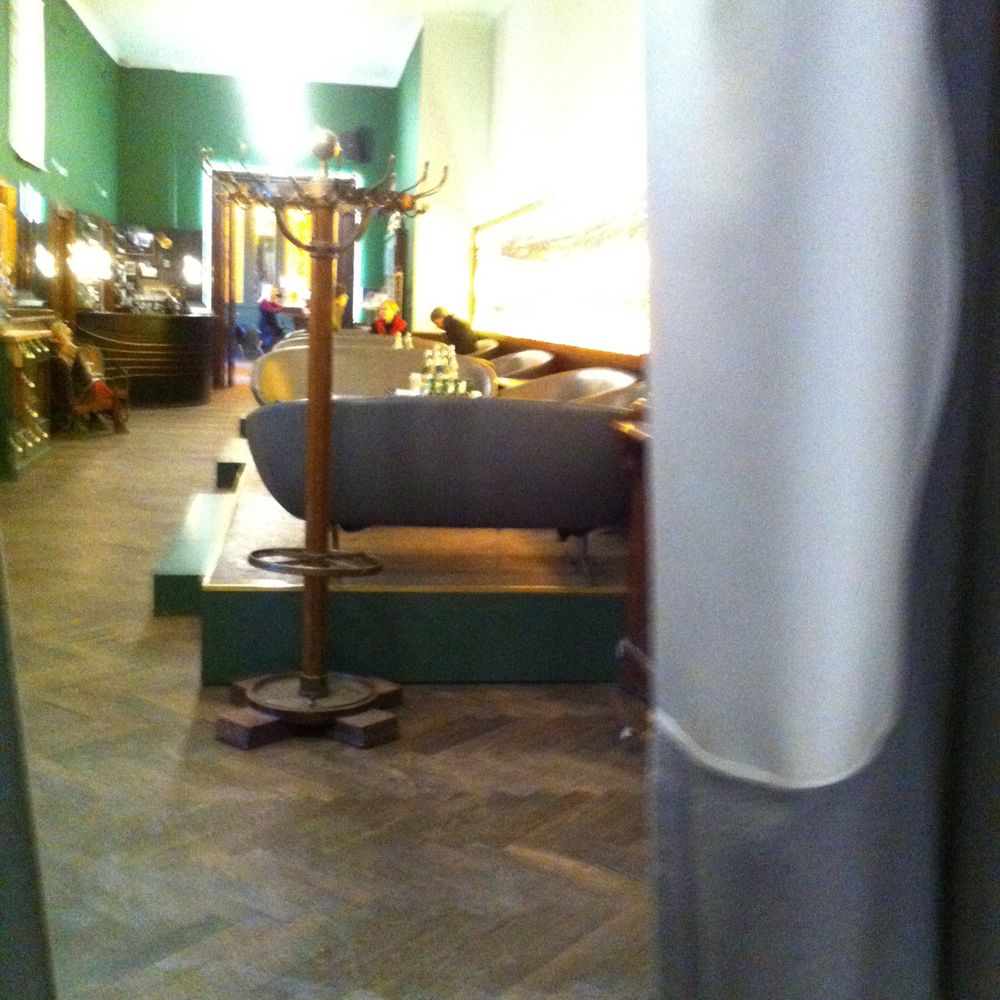
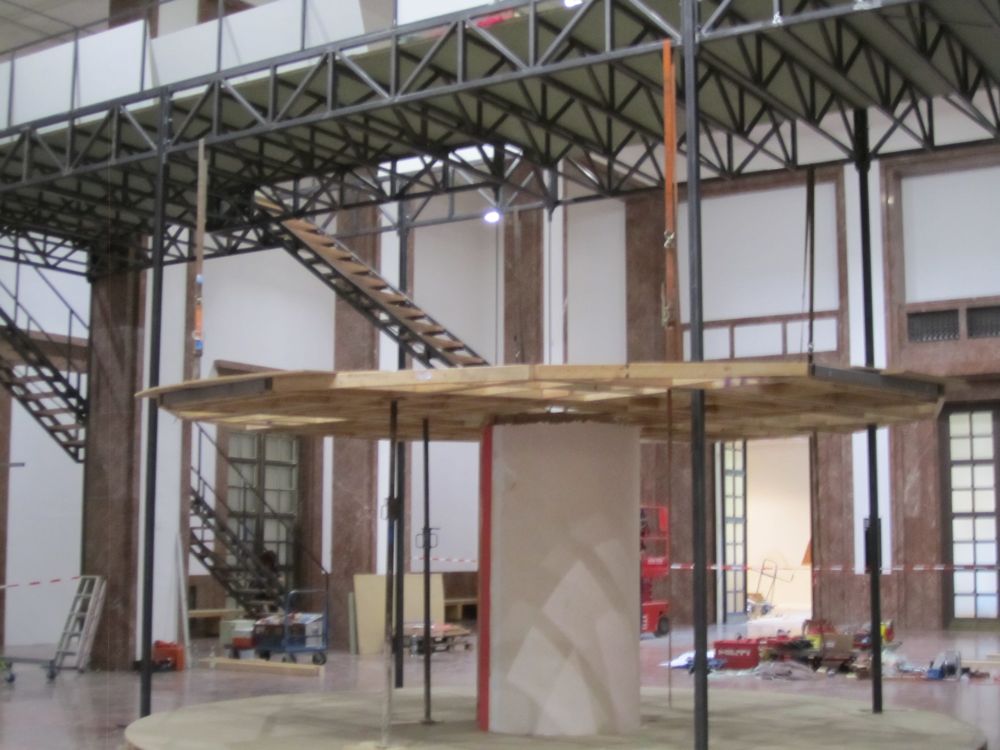
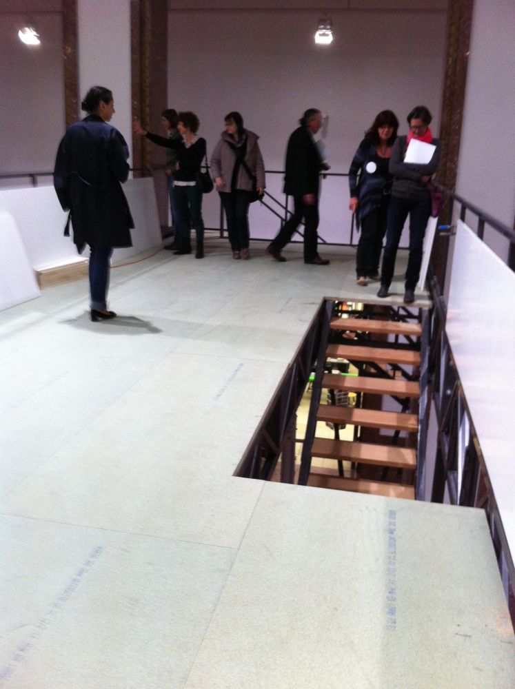
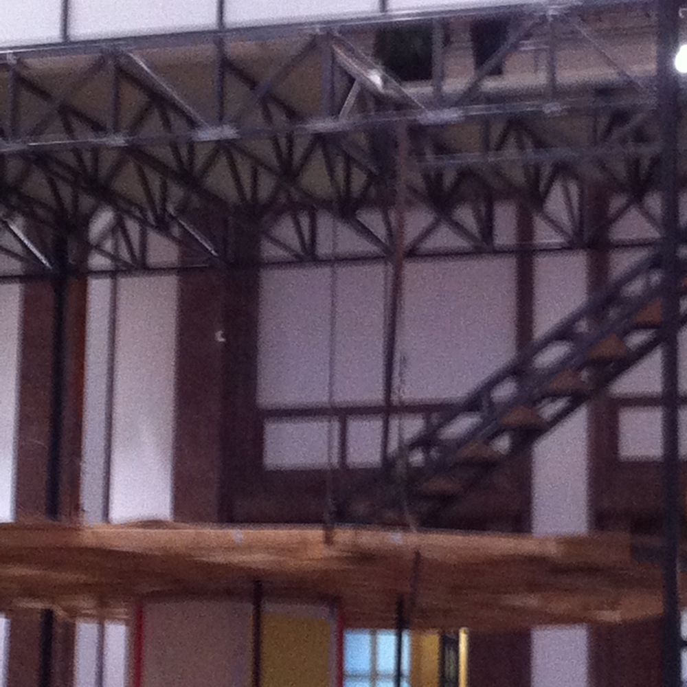
Manfred Pernice ... will create an expansive, accessible installation consisting of various, often "recycled" works. The artist is interested not only in the reusing of found objects and materials of various origins, but also, what is more remarkable, he uses his own earlier works as architectural elements for new works or as installation pieces in altered contexts of meaning. Pernice's planned intervention for Haus der Kunst's central Middle Hall relates directly to the space's architecture and consists of two main elements: Pernice will place his architectural sculpture "Tutti" from the year 2010 in the middle of the room. A spiral staircase leads up to the sculpture's roof. From there, via a second staircase, the visitor reaches a bridge, which spans the Middle Hall and from which visitors can continually view the room from new perspectives. For the bridge, the artist will develop an installation, which, as a result of the work process, will evolve on site. This form of spontaneous response to the spatial conditions is characteristic of Pernice's sculptural approach.
My friend who came with me to the opening exclaimed more succintly: “Mager! Ich mochte lieber sehen…”
Additionally, the director of HdK, Okwui Enwezor (who is having a cusp birthday this week), described Pernice’s work as an “intervention in the global crisis of modernity.”
The artist and sponsors (the Friends of Haus der Kunst) also spoke at length about the sculptural installation, which seems to suggest they realize that even for HdK regular patrons it requires some type of backgrounding. I give HdK a lot of credit for trying out global-art-fair-type works in its austere central hall and for the integration (too seamlessly really) into the “renovation.”
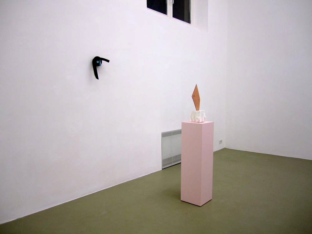
Having just been in six airports in six days, the kind of indistinguishable elevations, chutes, and stopping spaces of those reminded me of Tutti IV in sort of a vague “I’m tired” (not “I’m aware of phenomenology) way. I think maybe also for people living in München the trappings of renovation – with both the Lenbachhaus and the Pinakothek der Moderne having recently reopened – plus the endless “installations” of scaffolding and rerouting at the Hauptbahnhof and Marienplatz – are part of the normal whirring scenic backdrop of the city.
by Jean Marie Carey | 23 Jul 2013 | Art History, German Expressionism / Modernism
Danaé Xynias’s “Weite Fluren” is a good match for the Orangerie.
In framing the composition of a landscape painting, the challenge to the image maker, following eons of tradition, comes down fundamentally to where to place the horizon line. Contemporary painters have toyed with this problem experimentally, such as in Colin McCahon’s various large-panel installations of volcanic vistas in New Zealand. At the far reaches of these modern manifestations falls Trevor Paglen’s Covert Operations and Classified Landscapes (2010) presenting the horizon as, also, metaphorically unreachable. To sort of put things back into perspective, so to speak, Danaé Xynias makes the brave choice to return to the subject of landscape painting – the meeting of land (or water) and sky – allowing the horizon line to settle for the most part naturally in the center of her canvases.
Xynias’s current exhibition, “Weite Fluren,” is a mixture of landscapes and stylized still-lifes. (The still-lifes are certainly interesting in their own right, with rounded forms of pumpkins and melons against a zero-depth background intensifying the relationship between subject and frame.)
A reference in the catalog for the show marks an oblique historical lineage by referencing both Caspar David Friedrich and Jacob van Ruisdael, demurring that Xynias doesn’t quote them directly. This is true, though particularly the low clouds often associated with the van Ruisdael family are a clear evocation of the past. Make no mistake though Xynias is strictly a modernist, in the sense that her facture is very clean, the painted surface entirely flat and removed from the content in careful application. The space Xynias makes reference to in the exhibition title is obviously something that is of keen interest in its totality to the painter, a graduate of the Kunstakademie Düsseldorf who practices in a remote studio in Niederbayern. “Weite Fluren” is luminous in its incarnation at the Orangerie in the Englischer Garten, the classicizing space with the summer-lush exterior always at the peripheral always in view. The show is hung simply, without name markers as a distraction, with the larger landscapes singly or in groups slightly above eye-level, making visitors have to look “up” into the skies of the paintings.

by Jean Marie Carey | 16 Jul 2013 | Art History
The Popular Artist Jeremy Deller…
Felix Burrichter, the editor and creative director of PIN–UP (“the only biannual magazine for architectural entertainment”) and the curator of the current “Paper Weight — Genre-defining Magazines 2000 to Now” at Haus der Kunst explained his work process for the exhibit quite simply. The present-day print artifacts were chosen to reflect a range of well-known and unknown individuals showcased in magazines defiantly having a post-print life “off the reading table.”
More slickly produced and (seemingly) precisely targeted than Nick Logan’s The Face, which arguably is the forerunner, at least in typographic/photographic style of many of these volumes, the periodicals examined in Paper Weight are densely specific.
Visually, the exhibit at Haus der Kunst depends barely at all on a background knowledge of what are essentially very glossy ‘zines. Architect Andreas Angelidakis was clever to blow up the magazine covers to slightly-smaller-than-billboard sizes but particularly to make the finishes completely matte and impermeably saturated; they recall story boards but make visitors feel as if they are moving about the set of Lars von Trier film. (There are a few unfortunate Tracey Emin-recalling pieces of furniture here and there but nothing too invasive.
My favorite scene was the proximal juxtaposition of what happens to be the cover of the current edition of Fantastic Man featuring a stunning portrait of conceptual artist Jeremy Deller in a pink hoodie angled near a 2012 issue of The Gentlewoman featuring Angela Lansbury against a complementary tarama salada background. Fantastic Man of course is obviously trenchant and droll somewhat in the manner of the late Quentin Crisp while The Gentlewoman takes itself quite seriously (the Lansbury cover is somewhat of an anomaly with the usual sitters ranging within Beyonce and Christy Turlington to the same equestrienne-socialites you also don’t know from W and Town & Country.
(more…)

by Jean Marie Carey | 5 Jun 2013 | Art History, German Expressionism / Modernism
Artists in Schwabing.
Some Anglophones were saying recently how there were no artists neighborhoods left in München, specifically how there were no longer any such enclaves in Schwabing. I think what the person actually meant is that George Maciunas isn’t walking up and down Schellingstraße tossing boxes of junk around, leafleting, or setting up a utopian community in a Hofpfisterei storefront, meaning, there are few obvious visual social interruptions of “bohemian-ness” to the reality that it is very expensive to live or have a gallery space in the center of the city there is sometimes a tremendous, pressured sense of homogeneity in the immediate environment. This is both a true and false perception.
(more…)
by Jean Marie Carey | 24 Apr 2013 | Art History, Music, Re-Enactments© and MashUps
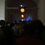
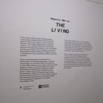
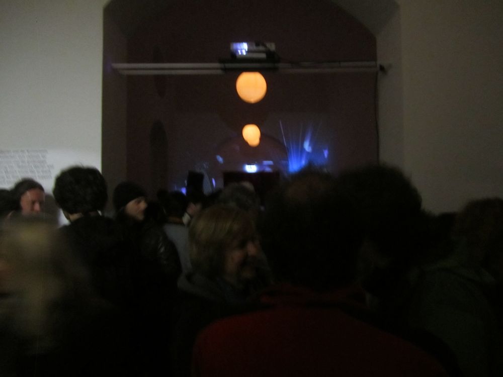
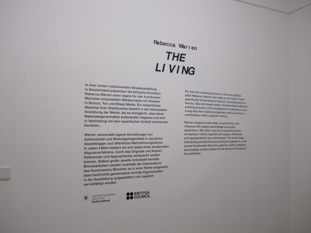
The opening for Rebecca Warren’s installation at Kunstverein München on 19 April 2013 was dramatically heightened by a rain so steady and soft it enveloped more like fog. To be clear it’s just me who is describing Warren’s experiment in biomorphic austerity as an installation; you can read more about the British artist’s commission for the Kunstverein here if you do not mind the maddening floating text. One of the good things about the script for this exhibit is actually that it does not try to overexplain the sculptor’s intentions, a la the surfeit of “instructions” that seem to come with other conceptual sculptural works such as those by Teresita Fernández.
The main space is occupied by a columnar arrangement of tall cast bronze totems, embellished with female-ish parts, regularly spaced but not wholly viewable at a take. To me this suggested a course of weave poles like those on agility courses for dogs, so that was my “phenomenological” approach. The objects above were set above and in an alcove; overall, especially at night, an effective use of the placement of the Kunstverein building’s windows.
All vastly oversimplified, of course.
An “afterparty” in the foyer featured a fantastic set by Berlin-based turntable-techno-transformative-sounds collective M.E.S.H. that almost enticed some reactive dancing.


